
Back to work

A&S Heritage Farms.

One farm, several lines of work. I redesigned its emblem around livestock, aquaculture and crops, then developed a brand system and website that bring its activities together.

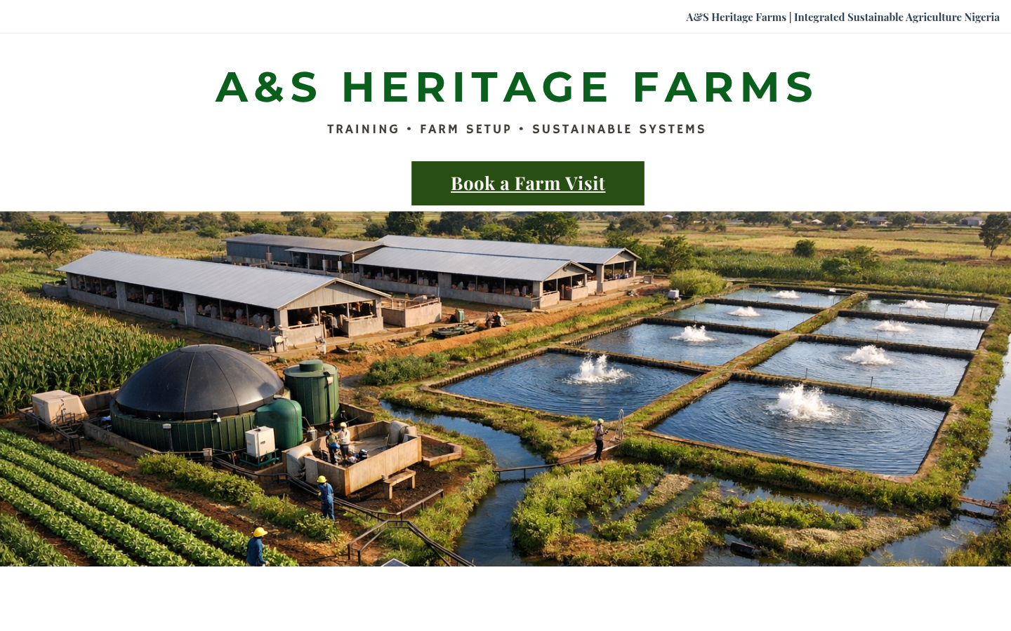
https://heritagefarmsa.com/A&S Heritage Farms homepage showing the integrated farm and a Book a Farm Visit action

Three activities. One identity.

The client had already chosen the name. My brief was to give it a visual identity that represented the whole business and a consistent way to communicate it.

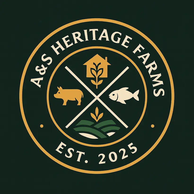
Redesigned circular A&S Heritage Farms emblem with livestock, fish and crops
Logo redesign · Livestock, aquaculture and crop cultivation
01 / THE EMBLEM

A shared sign for a connected farm.

The badge brings a livestock symbol, fish and cultivated fields into one mark. A forest green, earth brown, wheat and clay palette gives the wider identity a natural, grounded feel.

Forest#0D3D2B
Earth#6C4E2A
Wheat#D5A354
Clay#E9E0D2
Cover of the A&S Heritage Farms brand guidelines
Brand guidelines · 2025

Explain the whole without losing the parts.

I wrote a brand story and usage guidelines to keep the identity consistent. For the website, the challenge was different: help customers, prospective trainees and visitors understand the farm's activities and find the right next step.

Introduce the model

The opening message presents the integrated farming approach, so the different activities have a shared context.

Separate the offers

Distinct sections explain crop farming, aquaculture, farm setup, training and visits in terms visitors can use.

Make the next step clear

A direct farm-visit path helps interested people move from exploring the site to an enquiry.

One identity, with room for every offer.

A redesigned logo, brand palette, story and guidelines, followed by a live website that presents the farm's connected activities and gives visitors a clear route to enquire about a visit.

Explore the live website (opens in a new tab)
NEXT PROJECTScoopAgain